In today’s competitive market, every opportunity to stand out is vital. For small business owners, marketing heads, and fleet owners, commercial truck wraps offer an innovative and cost-effective way to enhance brand visibility. This guide will walk you through everything you need about commercial truck wraps, from their types and design considerations to installation and maintenance. By the end of this guide, you’ll be well-equipped to make an informed decision about using commercial truck wraps for your business.
What are Commercial Truck Wraps?
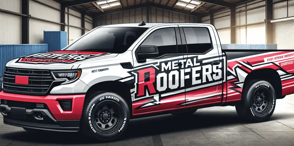
Commercial truck wraps are large vinyl decals or graphics applied directly to a truck’s surface. Commercial truck wraps can cover part or all of the vehicle and are designed to showcase a brand’s logo, message, and visuals in a bold and eye-catching manner. Unlike traditional paint jobs, commercial truck wraps are removable and customizable, offering businesses a versatile marketing tool.
Importance of Commercial Truck Wraps
High Visibility
Commercial truck wraps significantly increase a vehicle’s visibility on the road. Whether parked or in motion, these eye-catching graphics draw attention from potential customers, making your brand hard to ignore.
Brand Awareness
Consistent and mobile advertising through commercial truck wraps helps build brand awareness. Each vehicle trip introduces your brand to new audiences, reinforcing recognition and familiarity.
Professional Image
A well-designed truck wrap enhances your business’s professional image. It conveys a sense of reliability and quality, crucial for building trust with potential customers.
Competitive Advantage
Striking vehicle graphics gives businesses a competitive edge. In crowded marketplaces, standing out visually can be the difference between being noticed or overlooked.
Benefits of Commercial Truck Wraps
Cost-Effective Advertising
When considering alternative forms of advertising, commercial truck wraps are a financially advantageous option, like billboards or TV ads. The one-time investment provides continuous advertising for years, maximizing returns.
Wide Reach
Mobile marketing ensures that people see your message and reach a broad and diverse audience. Each drive exposes your brand to thousands of potential customers, spreading awareness far and wide.
Customization and Flexibility
Commercial truck wraps can be tailored to specific marketing needs and campaigns. Whether promoting a new product or a limited-time offer, commercial truck wraps allow you to update your message as needed.
Protection for Vehicles
Beyond advertising, wraps protect the vehicle’s paint from damage and wear. This helps maintain the vehicle’s resale value and keeps it looking pristine.
Easy Maintenance
Maintaining commercial truck wraps is straightforward. They look new with regular washings in mild soap and water, while their durability ensures longevity.
Specific Advantages for Small Businesses
Local Targeting
Commercial truck wraps are ideal for targeting local customers. Driving through your community makes your brand a familiar sight, strengthening local recognition and customer connections.
Increased Sales and Leads
With increased visibility comes more sales and leads. Potential customers who see people are more likely to recall your brand and contact you if they see your wrapped vehicle.
Enhancing Small Business Presence
Small enterprises must build a strong market presence. Truck wraps help create this presence, projecting a professional and trustworthy image to the local community.
Specific Advantages for Fleets
Uniform Branding
For businesses with multiple vehicles, uniform branding through commercial truck wraps creates a cohesive and professional look. This consistency reinforces brand identity and recognition.
Fleet Management Benefits
Consistent branding across a fleet simplifies management. It ensures that all vehicles present the same message, maintaining a unified brand image.
High ROI
Commercial truck wraps offer a high return on investment. Their long-lasting nature and extensive reach make them a valuable marketing tool for fleet owners.
Understanding Commercial Truck Wraps
Definition and Concept
Commercial truck wraps are large vinyl graphics or decals applied to the surfaces of vehicles. These wraps can cover parts of a truck or the entire car, transforming it into a mobile billboard. Commercial truck wraps use high-quality materials to ensure durability and vibrant visuals that catch the eye.
Types of Commercial Truck Wraps
Understanding the different types of vinyl truck wrapping is essential for choosing the right one for your business needs.
Full Wraps vs. Partial Wraps
- Full Wraps: Cover the entire truck, offering maximum visibility and impact. They are ideal for businesses looking to make a significant statement.
- Partial Wraps: Cover only specific truck parts, such as the sides or rear. They are cost-effective and still offer substantial marketing benefits.
Custom vs. Pre-designed Wraps
- Custom Wraps: Tailored to your specific brand requirements, custom wraps allow for complete creative freedom. This option ensures your wrap is unique and aligned with your brand identity.
- Pre-designed Wraps: These templates can be slightly modified to fit your brand. They are more affordable and quicker to produce but may need more custom wraps.
The Process of Applying Vinyl On Commercial Trucks
Applying vinyl on commercial trucks involves several steps:
- Designing – A custom design is created, often incorporating the business’s branding elements.
- Printing – The design is printed onto high-quality vinyl material.
- Installing – Skilled technicians apply the vinyl to the vehicle, ensuring a smooth and seamless finish.
Choosing the Right Design For Commercial Truck Wraps
The design of your commercial truck wraps plays a crucial role in its effectiveness. Here are some factors to consider:
Factors to Consider
- Brand Consistency: Ensure the wrap design aligns with your brand’s colours, fonts, and overall aesthetic.
- Message Clarity: Your message should be clear and easily readable from a distance. Refrain from overcrowding the design with details.
- Visual Appeal: Use superior graphics and photos to make your wrap visually appealing and professional.
Understanding the Basics of Design
Design Principles
All outstanding designs are built on design principles. These principles include balance, contrast, alignment, repetition, and proximity. Balance ensures that your design feels stable and aesthetically pleasing. Contrast helps to highlight key elements and create visual interest. Alignment ensures that all elements in your design are well-organized and easy to follow. Repetition ties together different parts of your design, creating a cohesive look. Proximity groups related items together, making it easier for viewers to understand the content quickly.
Colour Theory
Colour theory is another essential aspect of design. The colours you select influence your audience’s emotions and perceptions. For instance, blue evokes trust and calm, whereas the colour red can evoke a sense of excitement or urgency. Understanding how different colours interact and the emotions they evoke can help you create a more effective design.
The Fonts
Fonts are more than just choosing a font. It’s about selecting the right fonts that enhance readability and aesthetics. The right font can convey your brand’s personality and tone. For example, serif fonts are often seen as traditional and reliable, while sans-serif fonts are modern and clean. Combining different font styles and sizes helps create a visual hierarchy, guiding the viewer’s eye to the most critical information.
Creating a Compelling Visual Hierarchy
Size and Scale
Size and scale are powerful tools for creating a compelling visual hierarchy. More prominent elements naturally draw more attention, so use size to emphasize the most critical parts of your design. For example, headlines should be more significant than body text to ensure they stand out.
Placement and Alignment
Strategic placement and alignment of elements can guide the viewer’s eye through your design. Placing critical components in your layout’s “sweet spots” can make your design more engaging. Alignment helps organize your elements neatly, making the design look polished and professional.
Use of White Space
White or negative space is crucial for creating a clean and focused design. It helps avoid clutter and makes it simpler for viewers to concentrate on the essential components. Proper use of white space can also make your design look more elegant and sophisticated.
Choosing the Right Colors
Understanding Color Perspective
Colour perspective is the study of how colours affect human behaviour and emotions. Different colours evoke different responses, so choosing colours that align with your brand’s message is essential. For example, green often symbolizes growth and health, resulting in eco-friendly brands favouring it.
Brand Consistency
Consistency in colour choices is vital for maintaining brand identity. Ensure that the colours you use in your design align with your brand’s colour scheme. This constancy contributes to strengthening brand recognition and building trust with your audience.
Contrast and Readability
Using contrasting colours can enhance readability and make your design more impactful. A strong contrast between the backdrop colour and the text makes your message easy to read. For instance, black text on a white background is highly readable, while low-contrast combinations can strain the eyes.
Effective Use of Typography
Font Selection
Selecting appropriate fonts is essential for establishing the mood and purpose of your design. Fonts match the overall aesthetic and message you want to convey. For example, a playful font might suit a children’s brand, while a more formal font would be better for a law firm.
Hierarchy and Emphasis
Various font styles and sizes can establish a hierarchy and emphasize essential information. Headlines, subheadings, and body text should have distinct styles to guide the reader’s eye through the content. Bold or italic styles can also be used to highlight important points.
Readability and Accessibility
Ensuring that your text is easy to read for all viewers is essential. Use clear, legible fonts and avoid overly decorative styles that may be hard to read. Additionally, accessibility features such as sufficient font size and colour contrast should be considered to accommodate visually impaired users.
Incorporating Strong Visuals
High-Quality Images
High-quality images are a must for any practical design. Grainy or pixelated images can undermine the professionalism of your design. Make an investment in important, high-resolution photos for your writing. Quality visuals can enhance your message and make your design more appealing.
Graphic Elements
Graphic elements like icons, illustrations, and other visuals can give your design more depth and appeal. These elements help break up text and make the content more digestible. Ensure that these graphics are consistent in style and complement the overall design.
Consistency in Style
Maintaining a consistent visual style across all design elements is crucial for a cohesive look. This consistency includes colours, fonts, and graphic styles. A unified style makes your design look more professional and helps reinforce your brand identity.
Balancing Creativity and Clarity
Clear Messaging
Your design should communicate a clear and concise message. Overly complex or ambiguous messages can confuse your audience. Focus on simplicity and clarity to ensure your message is easily understood.
Avoiding Overcrowding
Avoid clear of packing your design with too many components. A busy design may distract the user and weaken the impact of your message. Keep your design focused and streamlined to ensure maximum impact.
Simplicity and Impact
Simplicity often leads to more impactful designs. Strive for a minimalist approach that emphasizes the most essential elements. Simple designs are generally more memorable and effective in conveying your message.
Designing for Your Audience
Understanding Your Audience
Investigating and comprehending the preferences and behaviours of your intended audience is crucial for effective design. Knowing your audience’s preferences can help you tailor your design elements to resonate with them.
Tailoring Design Elements
Customize your design elements to suit the tastes and preferences of your target audience. This tailoring can include colour choices, imagery, and overall style. A style that addresses your audience directly is more likely to engage and convert.
Testing and Feedback
Gather feedback and test your designs with your target audience. This feedback can provide valuable insights into what works and what doesn’t. Use this information to refine and improve your designs.
Utilizing Modern Design Tools and Software
Popular Design Tools
Several design tools can help you create stunning visuals. Adobe Creative Suite, Canva, and Sketch are popular choices among designers. These tools offer many functions that can enhance your design process.
Features and Functions
Understanding the key features of these tools can help you utilize them more effectively. For example, Adobe Creative Suite offers advanced editing capabilities, while Canva is user-friendly and ideal for quick designs. Familiarize yourself with the functions that best suit your needs.
Staying Updated
Keeping up with the most recent design software and trends is necessary to keep a competitive advantage. Regularly explore new tools and features that can enhance your creativity and efficiency.
Practical Tips and Best Practices
Consistency Across Platforms
Ensuring your designs are consistent across various media and platforms is crucial for brand recognition. This consistency includes social media, websites, and print materials. A unified look across all platforms strengthens your brand identity.
Scalability
Designing elements that look good on different scales and sizes is essential for versatility. Your design should be adaptable to a business card or billboard. Ensure that all aspects are clear and legible at any size.
Reviewing and Refining
Regularly reviewing and refining your designs is vital for maintaining high quality. Take the time to assess your work critically and make necessary adjustments. Continuous improvement ensures that your designs remain effective and engaging.
The Wrap Process
Understanding the wrapping process can help you anticipate what to expect and plan accordingly.
Step-by-Step Guide from Consultation to Installation
- Consultation: Meet with a wrap specialist to discuss your goals, budget, and design ideas.
- Design: Work with a designer to create a mock-up of your wrap. This stage may involve several revisions.
- Production: The wrap is printed on vinyl sheets once the design is finalized.
- Installation: Professional installers apply the wrap to your truck, ensuring a smooth, bubble-free finish.
Timeline and Costs to Expect
- Timeline: The entire process, from consultation to installation, typically takes 2-4 weeks.
- Costs: Prices can vary depending on the wrap size and the design’s complexity. On average, full wraps can cost between $2,500 and $5,000, while partial wraps are more affordable.
Maintaining and Protecting Your Wrap
Maintaining it properly is essential to prolonging your truck wrap and keeping it looking fresh.
Best Practices for Cleaning and Maintenance
- Regular Washing: Wash your truck regularly with mild soap and water. Avoid using abrasive materials or high-pressure washers.
- Avoid Harsh Chemicals: Avoid solvents or harsh cleaning agents, as they can damage the vinyl.
- Inspect for Damage: Check your wrap frequently for indications of lifting or damage, and take quick action if necessary.
How to Extend the Life of Your Wrap
- Garage Parking: Whenever possible, park your truck in a garage or shaded area to protect it from UV rays.
- Waxing: Use a wrap-safe wax or sealant to improve the area’s defences against the weather.
- Professional Touch-Ups: If your wrap gets damaged, consult a professional for touch-ups to prevent further deterioration.
Measuring Success
Tracking the effectiveness of your truck wrap can help you understand its impact and make data-driven decisions.
Metrics to Track the Effectiveness of Your Wrap
- Impressions: Estimate the number of people who see your truck daily. Tools like GPS tracking can help quantify this.
- Customer Feedback: Gather customer feedback to know if they noticed your truck wrap and what they thought.
- Sales and Leads: Monitor any increases in sales or leads after deploying your truck wrap.
Case Studies and Success Stories
- Local Bakery: A small bakery saw a 20% increase in foot traffic after wrapping its delivery truck with colourful, mouth-watering images of its pastries.
- Landscaping Company: A landscaping company doubled their client base within six months using a vibrant, eye-catching truck wrap that showcased its services.
Conclusion
Commercial truck wraps are powerful marketing instruments that significantly increase your brand’s reach and visibility. By understanding the types of wraps, choosing the right design, and following best practices for installation and maintenance, you can maximize the impact of your investment. Remember to track your commercial truck wraps performance and adjust to ensure continued success.
When you’re prepared to improve your marketing approach with commercial truck wraps, contact our team for a consultation today. Let’s turn your trucks into moving billboards that drive results.
If you want to know more visit Truck Wraps.








No comments yet.